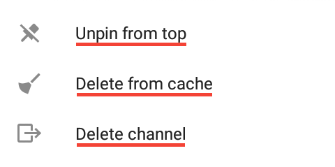
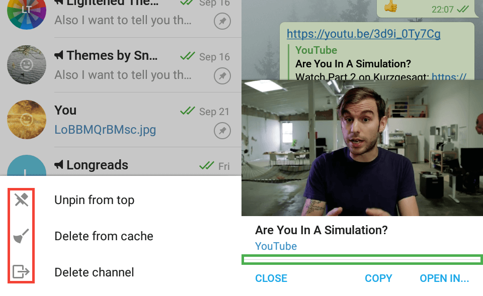
windowBackgroundWhite
Sets the background almost everywhere except the chat screen background. For example, it sets the background on the chats list screen or the background of sections in Settings.
While creating themes for Android Telegram, you can find elements which variable you don't know, or variables you don't know what they change. Worse yet, there are no descriptions of the variables in the in-app editor, so you have to ask someone who knows more about theming than you.
We started creating this glossary in order to collect variable descriptions in one place. The glossary already has descriptions of many variables, but much more are still to be described. And you can help to make it even better!
Every part of the glossary is free software. The source code of the website is available on GitLab here, and the most important part — the database — is available on GitLab here. You can contribute to these parts by opening merge requests against the repositories above, and once your merge request is merged, you can instantly see your contribution live!
Sets the background almost everywhere except the chat screen background. For example, it sets the background on the chats list screen or the background of sections in Settings.
Sets the secondary background, e. g. in Settings, between sections or below calls log if it doesn't fill the screen fully.
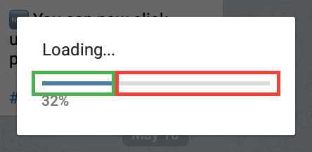
windowBackgroundWhite and the green areas show windowBackgroundGray.Sets the background on the chat screen, accepts either an image or a color. You must change this variable so Telegram includes your wallpaper in your theme. Changing the wallpaper in Settings → Chat Wallpaper won't include it in your theme.
Be careful: if you set an image as a wallpaper, Telegram will compress it every time you change any variable with the in-app editor. For this reason, you must set your image again before you share your theme.
Sets the color of almost all texts in the app.
Be careful: the bot inline result titles color is also set by this variable, although the background of the results isn’t set by windowBackgroundWhite but chat_messagePanelBackground. Consider setting the message panel background the same as windowBackgroundWhite or check the readability of the bot results.
windowBackgroundWhiteBlackText.Sets the last seen time color in Contacts.
Sets the color of descriptions below option titles in Settings. Also sets the color of the title on graySection.
Sets the color of a session’s IP in Settings → Privacy and Security → Active Sessions.
Sets the color of description texts below sections in Settings.
Sets the color of Telegram version at the bottom in Settings.
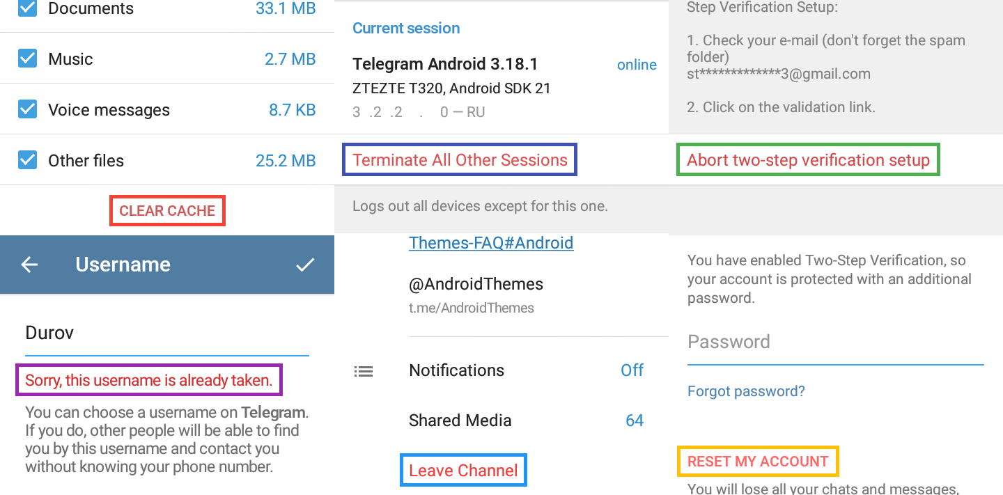
Sets the color of description texts below text fields like in Settings → Phone → Change Number and the color of the info text in “What is a Channel?” screen that appears when you try to create a channel (unless you already have one).
Be careful: this variable sets the color of text like “Please enter your password” on the gray background in Settings → Privacy and Security → Two-step Verification/Passcode Lock when you have either a two-step or a passcode lock password when you have (one of) them set.
Sets the color of a disabled item in Settings → Privacy and Security → Passcode Lock when you have no passcode lock.
Sets the color of the info text in Settings → Username.
windowBackgroundWhiteGrayText, the purple area shows windowBackgroundWhiteGrayText2, the dark blue area shows windowBackgroundWhiteGrayText3, the light blue area shows windowBackgroundWhiteGrayText4, the green area shows windowBackgroundWhiteGrayText5, the yellow area shows windowBackgroundWhiteGrayText6, the pink area at the bottom shows windowBackgroundWhiteGrayText7, and the brown area shows windowBackgroundWhiteGrayText8.Sets the color of red buttons on dialogs like the “Clear Cache” button in Settings → Data and Storage → Storage Usage → Clear Cache.
You can’t change this variable with the in-app editor for unknown reasons, so you have to use .attheme editor to change this variable.
Sets the color of red buttons in Settings like the “Terminate All Other Sessions” button in Settings → Privacy and Security → Active Sessions.
Sets the color of the “Abort two-step verification setup” button in Settings → Privacy and Security → Two-step Verification while setting up a two-step password.
Sets the color of warning text below a text field like in Settings → Username when you try to take a username less than 5 symbols or already taken.
Sets the color of warning buttons like “Leave Channel” in the channel info screen.
Sets the color of “Reset my account” button when you try to sign in your account that has a two-step verification password but you don’t remember it, try to restore it with your email but you can’t access it.
This variable can’t be changed with the in-app editor (because it closes after you sign out), so you have to use .attheme editor to change this variable.
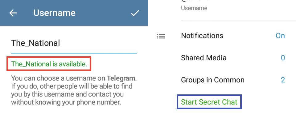
windowBackgroundWhiteRedText, the dark blue area shows windowBackgroundWhiteRedText2, the green area shows windowBackgroundWhiteRedText3, the purple area shows windowBackgroundWhiteRedText4, the light blue area shows windowBackgroundWhiteRedText5, and the yellow area shows windowBackgroundWhiteRedText6.Sets the color of success text below text fields like in Settings → Username when you take a username no one has and longer than 5 symbols.
Sets the color of green buttons like “Start Secret Chat” in the chat with a person info screen.
windowBackgroundWhiteGreenText and the blue area shows windowBackgroundWhiteGreenText2.Sets the color of section header in Settings.
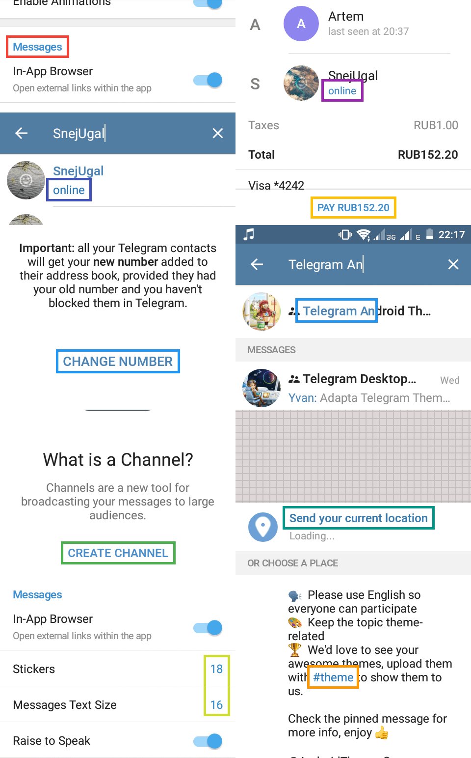
Sets the color of the Online status text in Contacts.
Sets the color of the Online status text in search results.
Sets the color of the “Change Number” button in Settings → Phone and also sets the match highlights in search results.
Sets the color of “Create Channel” button in “What is a Channel?” screen that appears when you try to create a new channel (unless you already have one). If the screen doesn’t appear to you, then use .attheme editor to change this variable.
Sets the color of the pay button after you entered all payment data when you’re buying something. You can make a fake pay with @ShopBot to see the button or use .attheme editor to add change the variable.
Sets the “Send your current location” button color in location attachment screen.
Sets the option value color in Settings.
Sets the color of links, like #hashtags, @usernames or just links in the chat info screen.
windowBackgroundWhiteBlueHeader, the purple area shows windowBackgroundWhiteBlueText, the dark blue area shows windowBackgroundWhiteBlueText3, the light blue areas show windowBackgroundWhiteBlueText4, the green area shows windowBackgroundWhiteBlueText5, the light orange area is windowBackgroundWhiteBlueText6, the teal area shows windowBackgroundWhiteBlueText7, the light green one shows windowBackgroundWhiteValueText, and the dark orange area shows windowBackgroundWhiteLinkText.Sets the overlay color that appears when you tap a link.

windowBackgroundWhiteLinkSelection.Like the field in Settings → Username.
Entered text color is set by windowBackgroundWhiteBlackText.
Sets the color of an input's placeholder — it's the text that you see before you enter any text.
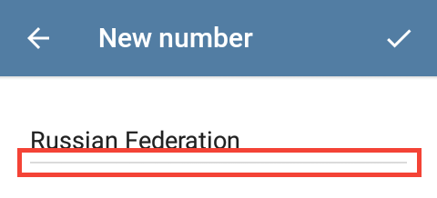
Sets the bottom border color when the input is inactive.
Sets the bottom border color when the input is active.
windowBackgroundWhiteHintText, the blue area shows windowBackgroundWhiteInputField, and the green area shows windowBackgroundWhiteInputFieldActivated.Like in Settings.
Sets the color of a switch track — its background — when the switch is turned off.
Sets the color of a switch thumb — the circle at the end of a switch — when the switch is turned off.
Sets the color of a switch track when it's turned on.
Sets the color of a switch thumb when the switch is turned on.
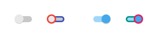
switchThumb, the blue area shows switchTrack, the green area shows switchTrackChecked, and the pink area shows switchThumbChecked.Like in Chat info → Notifications → Customize.
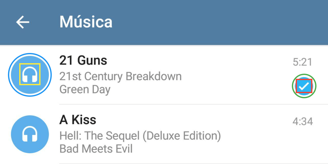
Sets the border of a checkbox when it's unchecked.
Sets the background of a checkbox when it's disabled. Like in Settings of a group that's not converted to a supergroup.
Sets the background of a checkbox when it's checked.
Sets the color of the check mark when the checkbox is checked.
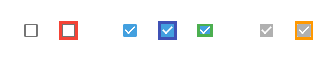
checkboxSquareUnchecked, the blue area shows checkboxSquareBackground, the green area shows checkboxSquareCheck, and the orange area shows checkboxSquareDisabled.Like your country's name in Settings → Phone → Change Number.
Sets the border color of this element.
windowBackgroundGrayLine.Sets the progress indicator when an edited message is being saved.
Sets the progress indicator when an edited message is being saved.
Sets the progress indicator on the action bar when a group is being created or a game is being loaded.
Sets the progress indicator on the action bar when a group is being created or a game is being loaded.
Sets the progress indicator on the top bar when opening a link using Instant View. These variables can be changed only with .attheme editor.
Sets the progress indicator on the top bar when opening a link using Instant View. These variables can be changed only with .attheme editor.
Sets the timer counting progress indicator when you're signing in and waiting for a call from Telegram that it will process automatically (usually Telegram makes a call when you're signed in another device but you can't access it to get the sign in code).
Sets the timer counting progress indicator when you're signing in and waiting for a call from Telegram that it will process automatically.

contextProgressInner1 and contextProgressOuter1, the green area shows contextProgressInner2 and contextProgressOuter2, he purple area shows contextProgressInner3 and contextProgressOuter3, and the orange area shows login_progressInner and login_progressOuter.Sets the color of the loading indicator below lists.
progressCircle.Sets the button background.
Sets the button overlay when it's pressed.
Sets the color of the icon near the profile. In groups where you are an admin this icon is “Set picture icon”, while looking at profiles it's “New Message” button or “Move to current location” on the location attach screen.
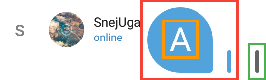
profile_actionBackground, the orange area shows profile_actionPressedBackground, and the green area shows profile_actionIcon.If a user doesn't have a profile picture or it's not loaded yet, a colored circle with a random color and one or two letters will be shown.
Sets the color of the letters on unloaded avatars.
Sets the color of gray lines that divide items of lists.
Sets the color of the ripple effect when you tap a list item.
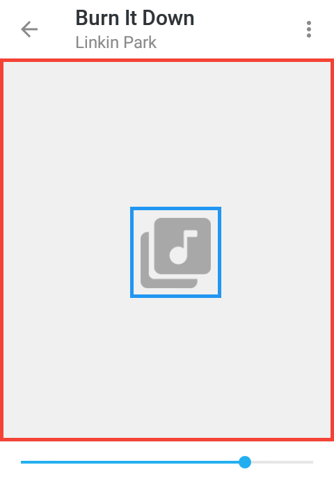
Sets the color of placeholder text — the text that you see if there's no content — when you open an empty list. You can see it in Chat screen → Attach — Music if you don't have any music. If you do, you can move them from the Music folder for a moment and move them back after you're done.
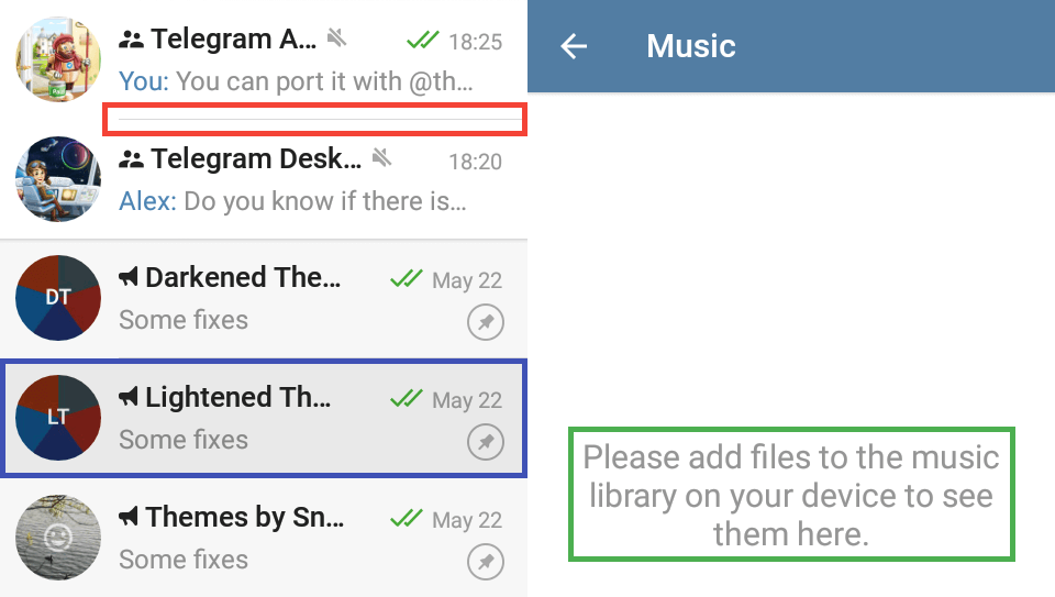
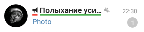
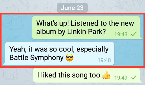
divider, the blue area shows listSelectorSDK21, and the green area shows emptyListPlaceholder.Sets the color of messages below the chat titles.
Sets the time or date color in the top right corner of a chat.
Sets the sender name color in groups.
Sets the color of texts like “You joined the channel” and also attached message type (like photo, GIF, video etc) if the sender name is omitted.
Sets the attached message type like photo, video, audio etc if the sender name is not omitted.
Sets the “Draft” text color that appears when you type some text and then close the chat without sending it.
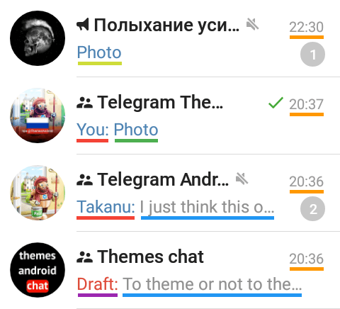
chats_message, the orange underline shows chats_date, the red underline shows chats_nameMessage, the light green underline shows chats_actionMessage, the dark green line shows chats_attachMessage, and the purple line shows chats_draft.Sets the title color of a chat.
Sets the icon color of a chat if the chat is a channel or a group.
chats_nameIcon and the green line shows chats_name.Sets the color of a secret chat title.
Sets the color of a secret chat icon.
chats_secretIcon and the blue underline shows chats_secretName.Sets the background color of unread counter background if the chat is not muted. Also it sets the background if the mention icon (“@”) if you've been mentioned in the chat.
Sets the background color of unread counter background if the chat is muted.
Sets the text color of unread counter, independently whether the chat is muted.
Note: the “@” mention icon cannot be changed for unknown reasons.
chats_unreadCounter, the green area shows chats_unreadCounterMuted, and the purple area shows chats_unreadCounterText.Sets the background color of a verified icon.
Sets the check color inside a verified icon.

Sets the background of the “New Message” button.
Sets the overlay of the the “New Message” button when it's pressed. The overlaying means that if you set the alpha channel of this variable to less that 255, the button won't become transparent, but it will mix two colors. It overlays only the background, but not the icon.
Sets the icon on the “New Message” button.
chats_actionBackground, the green area is chats_actionPressedBackground, and the yellow area is chats_actionIcon.The selector on this menu is listSelectorSDK21, because the menu is a list.
Sets the background color of the left panel.
Sets the text color on the left panel.
chats_menuBackground and the green underlines show chats_menuItemText.Sets the color of successful call in calls log or chat screen.
Sets the color of failure call in calls log or chat screen.
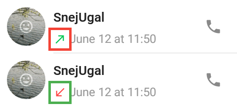
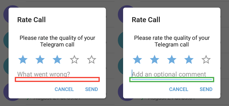
calls_callReceivedGreenIcon, the green area shows calls_callReceivedRedIcon.After you had a call and the call was ended, a “Rate the quality” prompt will appear. You may also force the prompt to appear if you go to Calls log, hold a history item and tap “Rate call”. Unfortunately, you can edit elements of the prompt only with .attheme editor.
Sets the border color of unchosen stars on the prompt.
Sets the fill color of chosen stars on the prompt.
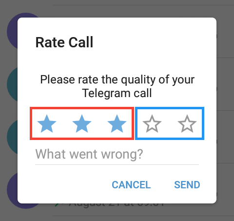
calls_ratingStarSelected, the blue area shows calls_ratingStar.Sets the app header background color. The background of the status bar is generated automatically (on Android 5.0 and above). The in-app player header, header in Settings and chat info and the header that appears when you select any messages have another variables.
Sets the color of icons on the action bar.
Sets the title color on the action bar.
Sets the color of the circle that appears when you tap an icon on the action bar.
Sets the color of the text that is below the title, like members amount, last seen time or “typing…” status.
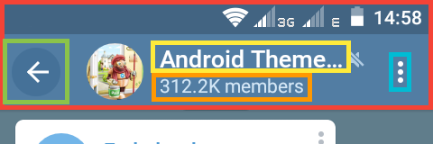
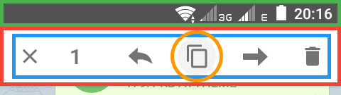
actionBarDefault, the light blue area shows actionBarDefaultIcon, the yellow area shows actionBarDefaultTitle, the green area shows actionBarDefaultSelector, and the orange area shows actionBarDefaultSubtitle.Action mode is the top bar dialog that opens when either chat bubbles get selected for reply, forwarding or edit or selecting shared files, music or link posts in chat shared media or attaching files in the message panel.
Sets the overlay color of the action mode panel. If you set the alpha channel of this variable to less than 255, the default action bar will be seen.
Sets the colors of the icon on the panel and the number of selected items as well.
Sets the color of the circle that appears when you tap an icon on the panel.
Sets the status bar background color, but it still gets darker for 20% though. Setting the alpha channel of this variable to zero will set the status bar color to actionBarActionModeDefault value.
actionBarActionModeDefault, the green area shows actionBarActionModeDefaultTop, the blue area shows actionBarActionModeDefaultIcon, and the orange area shows actionBarActionModeDefaultSelector.Submenu is the menu that appears when you tap the three dots icon on the action bar.
Note: the submenu in Photo Viewer depended on the variables below before, but doesn't anymore.
Sets the background of a submenu.
Sets the text color of submenu buttons.
actionBarDefaultSubmenuBackground and the blue area shows actionBarDefaultSubmenuItem.Sets the color of the text you can see if you haven't entered any text in the search field.
Sets the color of the entered text in the search field.
actionBarDefaultSearchPlaceholder, the green area shows actionBarDefaultSearch.The “What is a channel?” screen appears when you try to create a new channel if you didn't create any. If you did, you can change the variable only with .attheme editor.
Sets the circle color when you tap the back button.
actionBarWhiteSelector.Dialogs are the panels at the bottom or in the middle of the screen. For example, the one that appears when you tap a message or that one that appears when you hold a chat on the chat list.
Sets the background of dialogs.
Sets the small space between sections in Supergroup settings → Event Log → Settings.
dialogBackground and the green area shows dialogBackgroundGray.Sets the color of almost all text on dialogs.
dialogTextBlack.Sets the color of descriptions on the attach panel.
dialogTextGray2.Sets the link in sticker pack name underlay when you tap it.
dialogTextBlack.Sets the color of icons. For example, the ones that appear when you hold a chat on the chat list.
Sets the color of the border you can see in the in-app video player panel. You can open it by attaching a YouTube video link to your message, then tap the video preview image.
dialogIcon and the green area shows dialogGrayLine.Sets the background color of a badge — the counter you see when you forward messages or add stickers.
Sets the text color on the badge when forwarding message but not when adding stickers — it's set by picker_badgeText.
dialogBadgeBackground and the green area shows dialogBadgeText.Sets the text color of buttons on dialogs on those that appear in the middle of the screen — for example, when you're deleting a message.
Sets the button background color when you tap it.
dialogButton and the green area shows dialogButtonSelector.They should set radio buttons colors on dialogs, but they don't for some unknown reasons.
Set the same elements of the square checkboxes but on dialogs.

dialogCheckboxSquareUnchecked, the blue area shows dialogCheckboxSquareBackground, the green area shows dialogCheckboxSquareCheck, and the orange area shows dialogCheckboxSquareDisabled (note that it is how a disabled checkbox may look like, but we're not sure about that because we don't know where it is used).Sets the circle background that appears when you select chats you want to forward messages to on the forward panel.
Sets the color of the check mark on that circle.
dialogRoundCheckBox and the green area shows dialogRoundCheckBoxCheck.Sets the text field bottom border when the field is inactive. Inactive state is seen when you rate a call for 4 or less stars; you can get the ”Rate Call” prompt when you hold a call in Calls Log.
Sets the color of the bottom border below text fields when the field is active — almost all text fields on dialogs right after they appear.
dialogInputField and the green area shows dialogInputFieldActivated.Sets the background color of line progress you can see when you save to downloads any file (three dots beside a file on chat screen → Save to downloads).
Sets the color of the line that shows what percent has already been downloaded.
dialogLineProgressBackground and the green area shows dialogLineProgress.Sets the glow color you can see when you quickly scroll the attach panel.
dialogScrollGlow. In the default theme, it is white, and on this example image, it was made black, so one can clearly see it.Next variables set the background color of attach buttons.
Next variables set the icon color of attach buttons.
chat_attach*Background and their icons are changed by chat_attach*Icon.
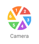
chat_attachSendBackground (it shows when you select at least one photo to send).Next variables set the colors of the “leaves” of the camera icon, in the clockwise direction.
The color of descriptions below buttons is dialogTextGray2.
Sets the background underlay color when you selected a message by holding them.
chat_selectedBackground.Sets the color of the message panel background.
Sets the color of the placeholder in the message panel that says “Message” or “Broadcast”.
Sets the color of the text inside the message panel.
Sets the color of the send icon in the message panel.
Sets the color of the icons inside the message panel.
Sets the text color on message bar to join a channel or group or cancel a voice/video message or mute/unmute a chat.
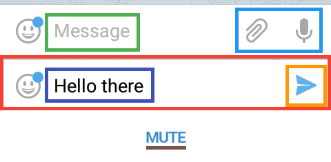
chat_messagePanelBackground, the green area shows chat_messagePanelHint, the dark blue area shows chat_messagePanelText, the orange area shows chat_messagePanelSend, the light blue area shows chat_messagePanelIcons, and the brown underline shows chat_fieldOverlayText (example of a channel).If you change the variables from this subsection with the in-app editor, you need to reopen the chat screen to see changes.
Sets the background color of panel for emojis, saved stickers, sticker packs in preview and bot keyboard below message panel with alpha value been layered on black.
Sets the color of the “No recent” text if no emoji is used or list cleared and recent list with clock icon is empty. To clear recent list, select and hold any recent emoji that doesn't have skin tones variations and confirm Clear in dialog.
Sets the color of all icons in horizontally scrollable row below message panel in emoji and sticker panel, except actually selected emoji set.
Sets the color of the emoji set selected icon.
Sets the color of a line that indicates actual emoji set on chat_emojiPanelShadowLine.
Sets the color of the backspace icon to delete last emoji added in message while still editing.
Sets the square background color on actual selected sticker pack.
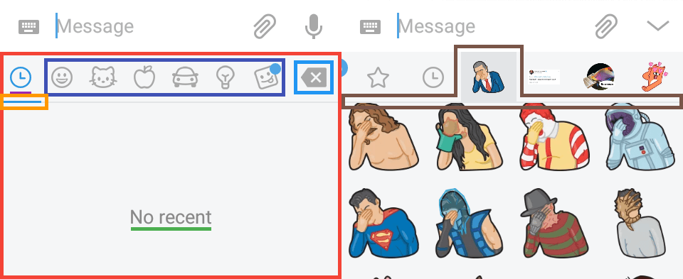
chat_emojiPanelBackground, the green underline shows chat_emojiPanelEmptyText, the dark blue area shows chat_emojiPanelIcon, the purple underline shows chat_emojiPanelIconSelected, the orange area shows chat_emojiPanelIconSelector, the light blue area shows chat_emojiPanelBackspace, and the brown area shows chat_emojiPanelStickerPackSelector.Unfortunately, the next five variables can be changed only with .attheme editor.
Sets the color of sticker packs titles when scrolling.
Sets the color of the remove or setting icon beside group stickers title.
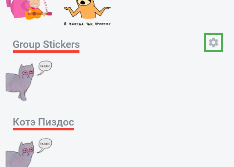
chat_emojiPanelStickerSetName and the green area shows chat_emojiPanelStickerSetNameIcon.Sets the background of "Remove" button in Trending Stickers section.
Sets the background of "Remove" button when pressed in Trending Stickers section.
Sets the blue dot color near the sticker pack title.
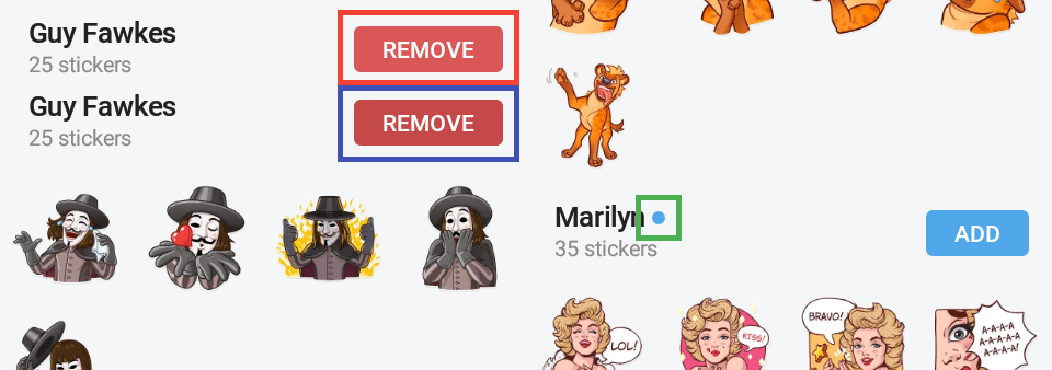
featuredStickers_delButton, the dark blue area shows featuredStickers_delButtonPressed, and the green area shows featuredStickers_unread.The background is chat_emojiPanelBackground.
Sets the text color on buttons in a panel below message bar, if programmed in a bot.
Sets the background color of the buttons.
Sets the button background color when tapped and is the selector of these buttons. it replaced the default color, so alpha channel less than 255 will make the button transparent.
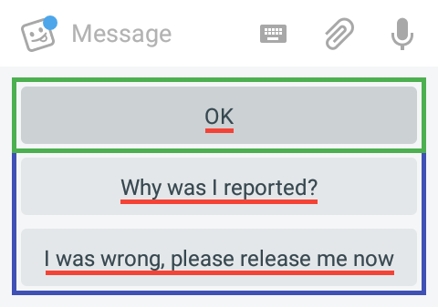
chat_botKeyboardButtonText, the dark blue areas show chat_botKeyboardButtonBackground, and the green area shows chat_botKeyboardButtonBackgroundPressed.The next two variables are used not only in Contacts, but primarily they are seen here.
Sets the color of icons.
Sets the header background color like “Contacts”. The title on this header is set by windowBackgroundWhiteGrayText2.
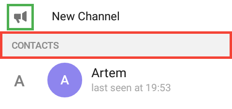
graySection, green — windowBackgroundWhiteIcon.Sets the color of the scrollbar when not pressed.
Sets the color of the scrollbar when you hold and move it and the bubble that contains the letter on where you are.
Sets the color of the letter inside the bubble when you hold and move the scrollbar.
fastScrollInactive, red — fastScrollActive, orange — fastScrollText.Sets the background of the bottom hint on the “Invite friends” screen.
Sets the text color of the hint.
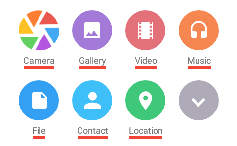
contacts_inviteBackground, yellow — contacts_inviteText.This part of glossary is about attach screens.
Sets the folder icon.
Sets the circle background below the folder icon.
Sets the file icon extension text.
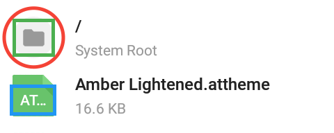
files_folderIcon, red — files_folderIconBackground, blue — files_iconText.Sets the color of the × below the red location icon when you move it across the map.
Sets the background of the button beside the “Send selected/your current location”.
Important note: you must re-enter the screen to see the actual color of the button if you change the variable with the in-app editor.
Set the icon on the button.
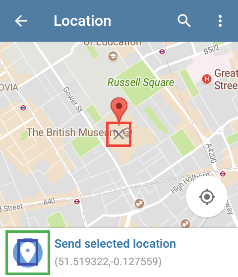
location_markerX, green — location_sendLocationBackground, blue — location_sendLocationIcon.The background of the icon from your music gallery.
The icon music inside musicPicker_buttonBackground.
The background of the check on the selected music.
The check icon inside musicPicker_checkbox.
musicPicker_buttonBackground, yellow — musicPicker_buttonIcon, green — musicPicker_checkbox, red — musicPicker_checkbox.The background of the send counter.
The number inside the circle.
The color of the “send” button when you haven't picked anything yet.
the color of the “send” button when you have picked items.
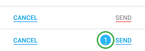
picker_badge, yellow — picker_badgeText, red — picker_disabledButton, blue — picker_enabledButton.The in-app editor opener button is overlaid when you open the editor. All player variables are available on the chats list screen, or you can use .attheme editor to change the variables.
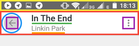
If you tap the top-left icon, you'll see an old-like player with action bar. It also appears when the playlist is big and you scroll the list.
Set the same things actionBarDefault, actionBarDefaultIcon, actionBarDefaultTitle, actionBarDefaultSubtitle and actionBarDefaultSelector respectively do.
Sets the status bar background color on Android 5.0 and higher, and, unlike in any other case, it's not darkened by 20% (if you want to do it, set the value to 0, 0, 0, 51). Setting the alpha channel of this variable to zero fallbacks to player_actionBar.
player_actionBar, the purple areas show player_actionBarItems”, the yellow area shows player_actionBarTop, the blue circle shows player_actionBarSelector, the green underline shows player_actionBarTitle, and the orange underline shows player_actionBarSubtitle.For the blue-to-pink area, see the Action Bar subsection.
For the gray-to-green area, see the Placeholder subsection.
Sets the background of the panel and also the seekbar panel.
Sets the played part indicator.
Sets the unplayed part indicator.
Sets the color of the track duration and the played part time.
Sets the color of non-pressed or inactive buttons.
Sets the color of pressed or active buttons.
This subsection doesn't describe new variables, these variables aren't used only here, their primary usage can be found in other sections of the glossary.
Sets the track title color.
Sets the color of the performer's name.
Sets the background color of play/pause buttons on the list.
Sets the icon color of play/pause buttons on the list.
Sets the background of submenus, e. g. when you tap the reverse button. The icons there are set by player_button and player_buttonActive.
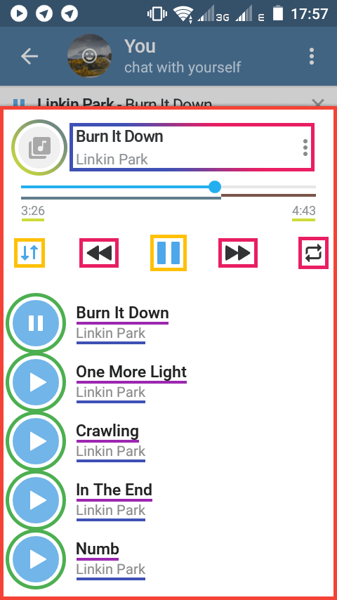
player_background, the blue gray underline shows player_progress, the brown underline shows player_progressBackground, the lime underlines show player_time, the orange areas show player_buttonActive, the pink areas show player_buttonActive, the purple underlines show windowBackgroundWhiteBlackText, the blue underlines show windowBackgroundWhiteGrayText2, the green circles show chat_inLoader. For gradient-stroked areas see the top of this subsection.You see the placeholder when the track doesn't have a cover.
Sets the background color of the placeholder.
Sets the color of the placeholder icon.
player_placeholderBackground and the blue area shows player_placeholder.When you start playing a track or a voice message, a panel at the top and below the action bar with audio controls appears. This subsection is about this panel.
Sets the background color of the in-app player panel.
Sets the color of the play/pause button of the in-app player panel.
Sets the text color of who performed the audio/song playing on the in-app player panel.
Sets the text color on the in-app player panel: for songs it sets the color song's name color, for voice messages shows when it was sent, for example yesterday at 08:05 A.M.
Sets the color of the close button inside the in-app player panel.
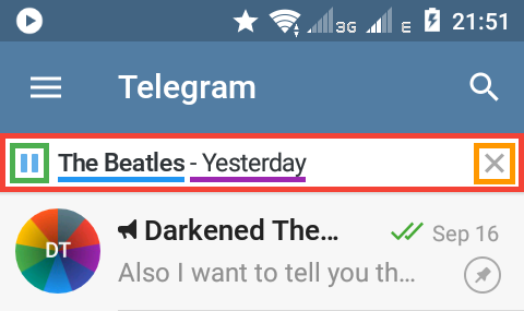
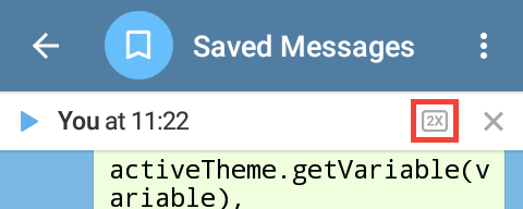
inappPlayerbackground, the green area shows inappPlayerPlayPause, the orange area shows inappPlayerClose, the blue underline shows inappPlayerPerformer, and the purple area shows inappPlayerTitle.Note by @Ra1nb0wD4sh: inappPlayerClose affects the color of the 2x playback toggle (appeared in 4.8.10) while it's in disabled state. inappPlayerPlayPause affects the color it has when enabled.
Sets the shadow color between sections in Settings.
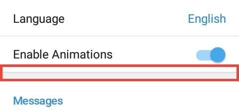
windowBackgroundGrayShadow.Sets the color of two SIM-cards and arrow between them in Settings → Phone.
Sets the color of phone and tablet image when you signed in only on one device, shown in Settings → Privacy and Security → Active Sessions.
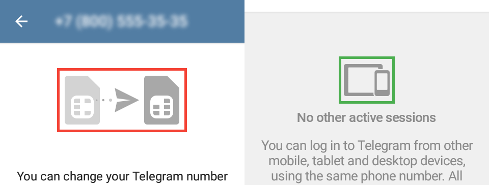
chagephoneinfo_image and the green area shows sessions_devicesImage.Sets the color of three dots icon beside a sticker pack or a theme.
Sets the ripple color when you tap the three dots icon.
stickers_menu and the red area shows stickers_menuSelector.Sets the color of the check mark you can see beside an added sticker pack or selected theme.
Sets the background of the “Add” buttons.
Sets the background of an “Add” button when you press the button.
Sets the color of the “Add” or “Remove” (on chat emoji panel) text on buttons.
Sets the color of the progress circle when a sticker pack is being added or removed (on chat emoji panel).
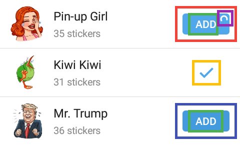
featuredStickers_addButton, the blue area shows featuredStickers_addButtonSelected, the green areas show featuredStickers_buttonText, the orange area shows featuredStickers_addedIcon, the purple area shows featuredStickers_buttonProgress.These variables once were used, but now they've been removed from Telegram because their elements were removed or replaced with other variables.
listSelector — it was merged with listSelectorSDK21;
player_seekBarBackground — the element was removed;
player_duration — the element was merged with player_time.